Southwest Airlines, known for its no-frills service and friendly approach to air travel, has undergone a few visual transformations over its long history. One of the most iconic and recognizable liveries was the Canyon Blue livery, introduced in 2001. This vibrant design became synonymous with Southwest Airlines for nearly two decades and marked a significant shift in the airline’s branding. In this article, we’ll explore the history, meaning, and legacy of the Canyon Blue livery, and why it remains a beloved chapter in Southwest’s visual history.
Southwest Airlines Canyon Blue Livery: A Bold Era in Aviation Design
Table of Contents
The Introduction of Canyon Blue
Before 2001, Southwest Airlines’ planes were painted in the traditional “Desert Gold” livery, featuring a brown, orange, and red color palette that reflected the airline’s early branding. However, as Southwest Airlines expanded and modernized, the company decided it was time for a visual refresh that would represent the airline’s future.
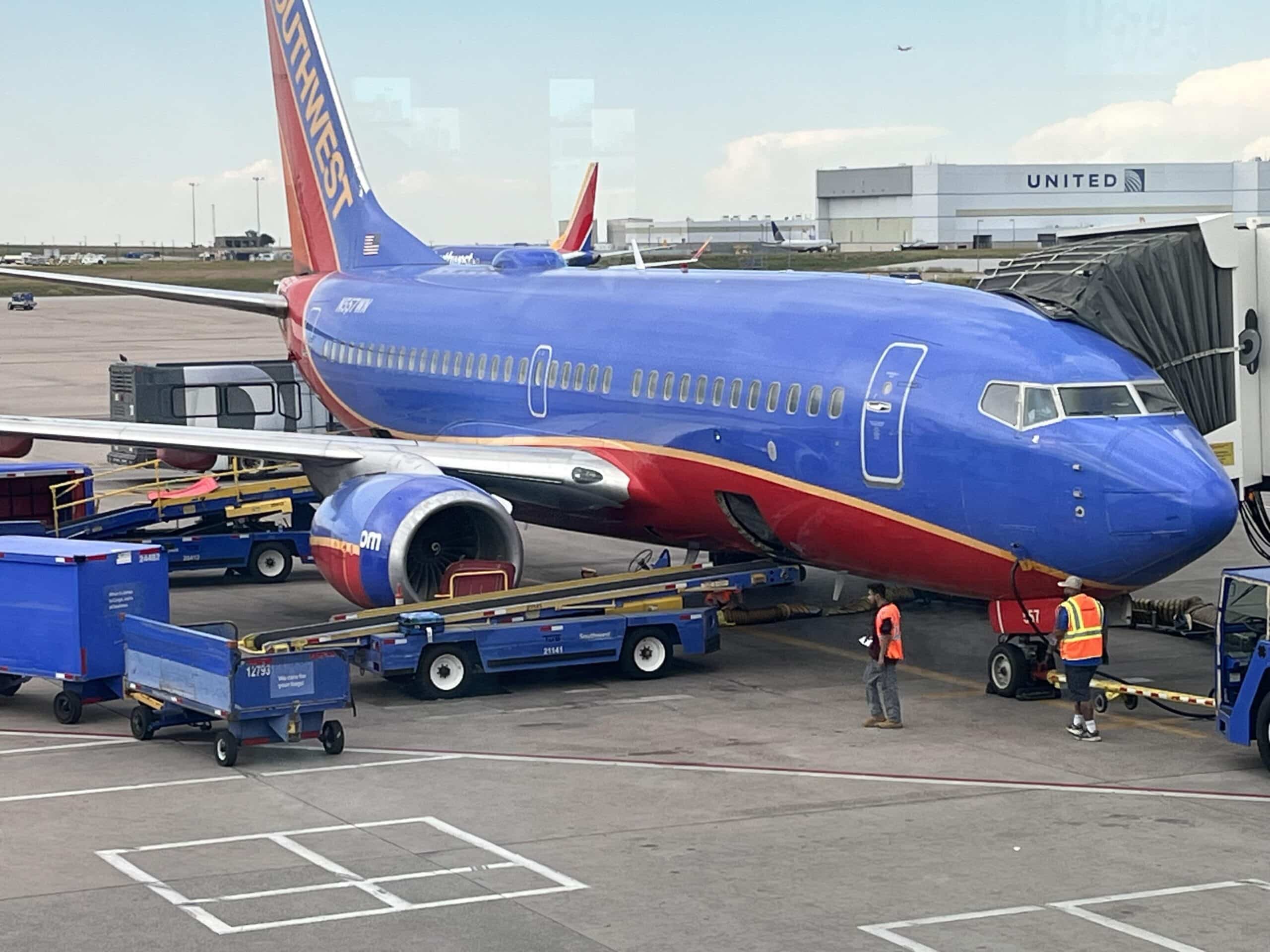
The Canyon Blue livery was introduced in June 2001 as part of Southwest Airlines effort to update its image and capture a more modern, vibrant aesthetic. It marked a departure from the earthy tones of the Desert Gold era and introduced a fresh new look that symbolized energy, professionalism, and a forward-thinking approach.
Key Features of the Canyon Blue Livery
The Canyon Blue livery featured several key elements that made it a striking and memorable design:
- Vibrant Blue: The dominant color of the livery was a rich, bold blue called “Canyon Blue,” inspired by the bright skies and scenic canyons of the American Southwest. This blue was intended to evoke a sense of reliability, trustworthiness, and calm—key values in air travel.
- Red and Orange Accents: Complementing the blue were vibrant red and orange accent stripes along the fuselage. These colors created a dynamic contrast and represented the warmth, friendliness, and fun-loving spirit that Southwest Airlines is known for.
- Yellow Tail: The aircraft tail featured a bright yellow accent, further reinforcing the energy and optimism of the Southwest brand.
- Southwest Heart Logo: Although the livery was introduced before the now-famous “Heart” branding took over, the design still incorporated elements of Southwest’s dedication to customer care and service. The airline’s name was displayed prominently in bold white letters, signaling its presence and confidence in the skies.
The Significance of Canyon Blue
The Canyon Blue livery wasn’t just a cosmetic change—it marked a pivotal moment in Southwest’s evolution. By 2001, Southwest Airlines was expanding its operations nationwide and transitioning from a regional airline into a major domestic carrier. The new livery signified this shift in growth and ambition, while also maintaining the airline’s commitment to its core values of affordability, efficiency, and fun.
The livery played a major role in Southwest’s public image for nearly two decades, appearing on more than 700 of the airline’s Boeing 737 aircraft. As passengers became accustomed to the bold colors of Canyon Blue, it became an unmistakable symbol of Southwest Airlines’ reliability and approachable service.
Evolution and the Transition to the “Heart” Livery
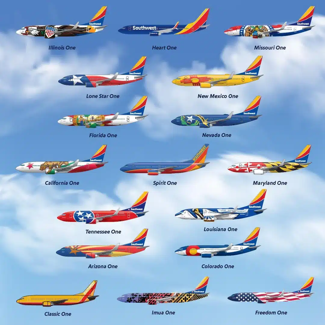
While Canyon Blue was widely loved, in 2014, Southwest Airlines again decided to modernize its image with the introduction of the “Heart” livery. This new design kept some of the Canyon Blue elements, such as the red, yellow, and blue color scheme, but made several notable changes:
- The Heart livery introduced a cleaner, sleeker look with bolder, more refined graphics.
- The aircraft’s belly was painted in a striking red, signifying Southwest’s “heart” and dedication to its customers.
- The tail design was updated with a more contemporary style, featuring bold stripes of blue, yellow, and red to create a dynamic and modern look.
Despite the change, the Canyon Blue livery is still cherished by many, and a significant number of aircraft continue to fly with this classic look.
Why the Canyon Blue Livery Stands Out
- A Break from Tradition: Canyon Blue marked a bold departure from the more muted tones of Southwest’s original Desert Gold livery, making the airline stand out more clearly against competitors.
- Symbol of Growth: The introduction of Canyon Blue coincided with Southwest’s nationwide expansion and emergence as one of the largest domestic airlines in the U.S.
- Memorability: The vivid blue, red, and orange design made Southwest planes instantly recognizable, whether at the gate, in the air, or in advertisements. It became one of the most iconic liveries in U.S. aviation history.
- Customer Connection: Southwest Airlines is known for its customer-centric approach, and the warm, vibrant colors of the Canyon Blue livery resonated with passengers, representing the airline’s focus on friendly service and reliability.
Southwest Airlines’ Canyon Blue livery represents a significant chapter in the airline’s history, reflecting its growth, energy, and optimism. The bold design helped Southwest solidify its place as a major player in U.S. aviation while staying true to its roots as a fun and affordable airline. Though the livery has now transitioned to the newer “Heart” design, Canyon Blue remains a nostalgic favorite for aviation enthusiasts and loyal Southwest passengers alike.
Whether flying across the country or spotting a plane on the runway, the Canyon Blue livery will always be remembered as an era of bold moves and enduring service.


